Display Exploration
A design strategy for display advertising, prepared for Hearst Newspapers
Goals
Improve Ad Experience for Users
Consistent and reliable ux conventions for ads
Design that complements websites
Advertising can inform and enrich reading experience, not just disrupt it
Improve Ad Experience for Advertisers
Better and consistent ux means better performance (probably!)
Quick to market (re-use assets that already exist for social media and other platforms)
Flexibility and optimization (swap images, test headlines, all without supplying new creative!)
Inspiration
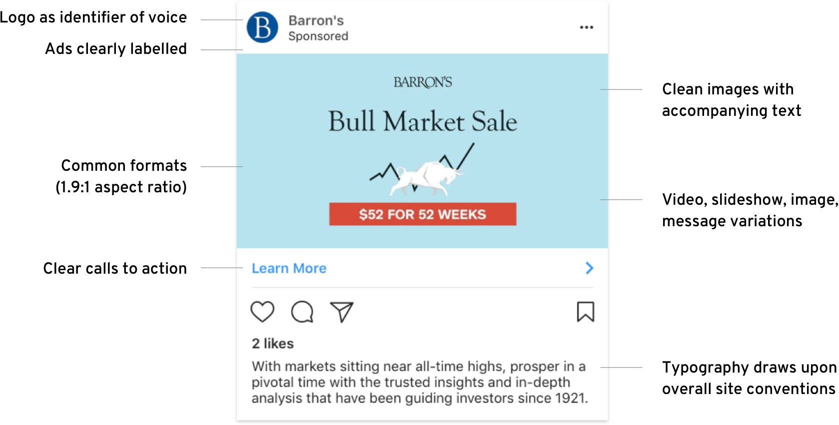
Design informed by advertising on social media:
Outline
This strategy places a given ad into one of three buckets:
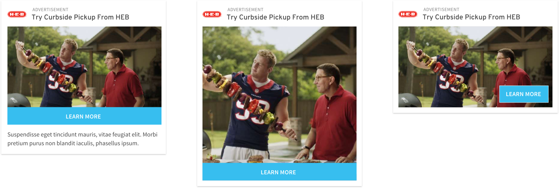
Native Display
Our native ad framework allows advertisers to broadcast their messages in a way that complements the reading experience. Those messages find credibility and value through visual association with news content.
Repurpose creative prepared for Facebook and Instagram
Easily performance-optimized
Eventual self-service platform using our existing customer data
Single Image
Multi Image
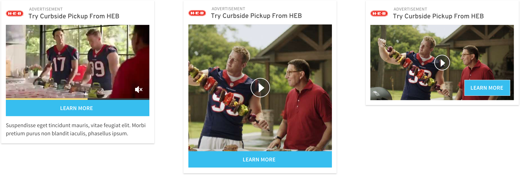
Video
Storybooks
Storybooks allow an advertiser to tell a full story in a single screen, without asking the reader to leave the article page experience. Building on our native ad framework, these formats can be thought of as stories within stories.
Designed to be highly engaging, these formats make use of a unique visual language that is distinctly tactile and material.
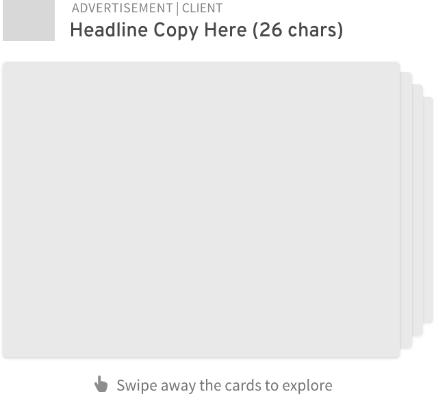
Dis-Card
Users can flip through a stack of cards by swiping them away one at a time.
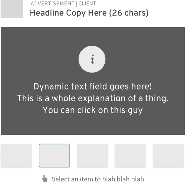
Selector
Tell a story consisting of several parts, but in no particular order.
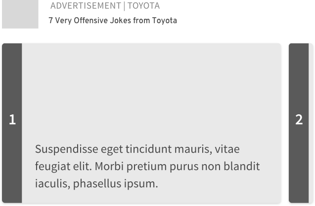
Listical
Nothing cute here, just a listical. People love those.
Standard Display
As much as we’d love to fully wean our business off of awful programmatic creative and to maintain control over the look and feel of all advertising on our sites, we’ll probably need to accommodate some traditional display advertising while we wait for certain folks to catch up.
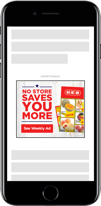
Standard 300x250 static creative
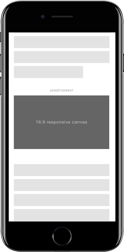
16:9 responsive canvas
To be continued…

